And just to be up front about this, the vast majority of these other things are totally weird. But what can you do? I don’t make the logos; I just report on them.
1. The Zune Logo
Look. I told you this wasn’t going to be a particularly classy list. But this might explain a whole lot about the Zune.
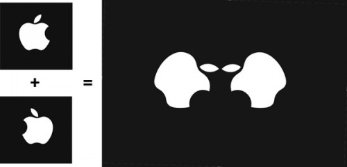
2. The Apple Logo Looks Like Half An Alien
Fodder for the theory that Steve Jobs is part of an alien race that brainwashes people with attractive product-packaging.
3. The Bulls Logo Looks Like An Angry Robot Reading A Book
He hates that book. And he hates you.
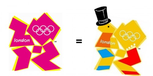
4. The 2012 Olympics Logo Looks Like Lisa Simpson Giving Someone A Hummer
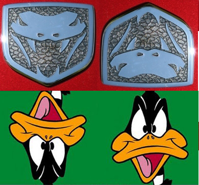
5. The Dodge Viper Logo Looks Like Daffy Duck
But Daffy Duck does not look like the Dodge Viper logo. How do you explain that?
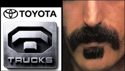
6. The Toyota Trucks Logo Looks Like Frank Zappa’s Mustache
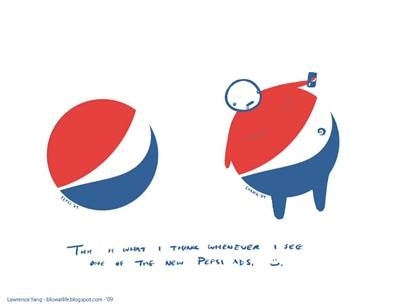
7. The Pepsi Logo Looks Like An Obese Man
With, like, serious back problems.
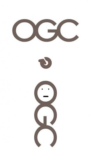
8. The OGC Logo Looks Like A Man Playing With Himsel
A fact that in and of itself is way more interesting than the British Office of Government Commerce which it represents.
9. The TGV Logo Looks Kind Of Like A Snail
10. The Texas Longhorns Logo Looks Like A Uterus
Luckily, they can just change their name to the UT Uteruses, and it alliterates nicely.
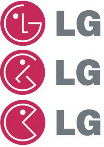
11. The LG Logo Looks Like A Broken Pacman
12. The Institute Of Oriental Studies Logo Looks Just Terrible
13. The Computer Doctors Logo Is Really Unfortunate
14. And These Logos All Look Like Goatse
15. Finally, just a quick reminder that “lol” looks like a drowning man
Which makes the whole thing just a little bit sad.








 Voodoo Game
 Favignana – Things to Do i...
 Learn How To Lose Jean Size In O...
 4 Stupidly Annoying Gym Behavior...
 Atlantis Submarine – Thing...
 The Pinnacles, Nambung National ...
 Weird Lego Creatures


i didnt get the zune one help me out plz
It looks like anus…